portfolio-website
A deep dive into the content-first design of this elegant showcase of interdisciplinary works.

1. DESIGN PHILOSOPHY
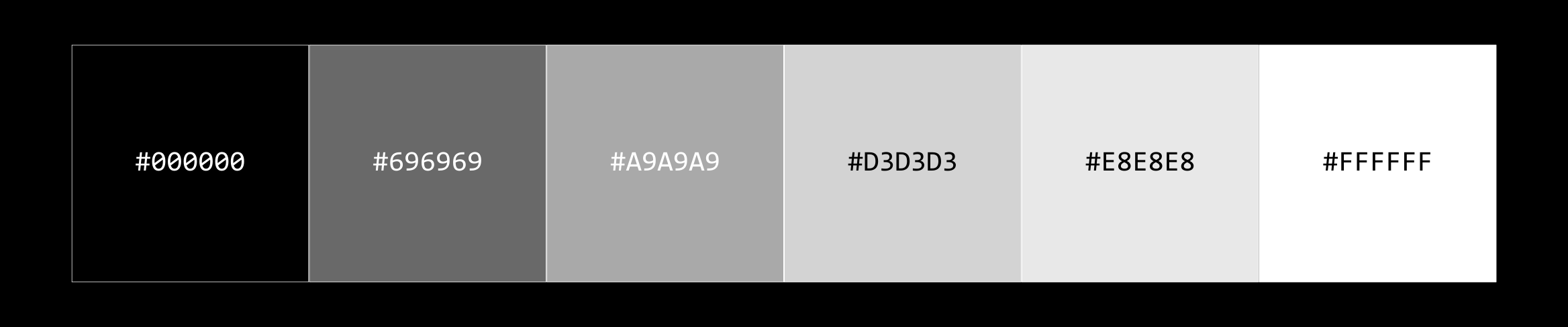
A gradient from black to white. No excess; every shade maps to a hierarchy level. Grayscale forces content to work harder, eliminating color as a crutch.
| Hex | Usage | Contrast Ratio |
|---|---|---|
#000000 |
Primary background | — |
#696969 |
Dividers | 5.5:1 AAA |
#A9A9A9 |
Tertiary text | 6.5:1 AAA |
#D3D3D3 |
Links & secondary | 8.5:1 AAA |
#E8E8E8 |
Interactive stetates | 16:1 AAA |
#FFFFFF |
Primary text | 20:1 AAA |
Typography: Figtree is a geometric sans-serif built on simple mathematical shapes rather than humanist curves. Letterforms are constructed, modern, and impersonal. Geometric type erases personality from the typeface itself, letting content dominate. Server-side rendering eliminates layout shift. Responsive: 16px desktop → 14px mobile.
Layout: 768px max-width centered with minimal padding. Mobile full-width. Breakpoint at 768px for responsive reflow.
Interactions: Subtle 150ms hover animations.
2. ARCHITECTURE
Markdown Parsing Pipeline
All content flows through a single pipeline. Raw .md files (with YAML frontmatter) enter at the top. The parser splits metadata from body, marked.parse() converts markdown syntax to HTML, then CSS styling applies design rules. Finally the <Markdown> React component renders it to the page.
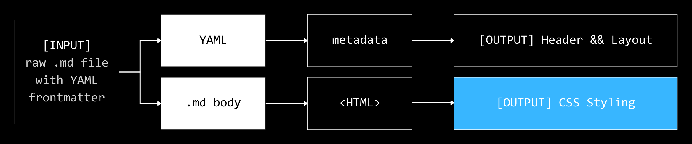
Each stage is reversible and portable: swap out marked.js for another parser, change CSS for a new theme, restructure components. The pipeline doesn't dictate those choices; it just sequences them.
Why this approach: Content stays version-controlled and offline-editable. No database abstractions. No server-side rendering. Static export guarantees indefinite uptime.
3. PERFORMANCE & ACCESSIBILITY
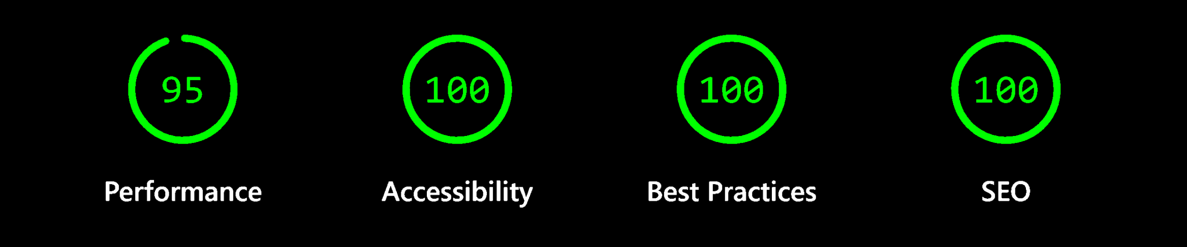
View detailed audit on GitHub
Measured on Feb 11, 2026 via Chrome Lighthouse 13.0.1
Accessibility Breakdown:
☑ WCAG AA color contrast (4.5:1 minimum)
☑ Semantic HTML (proper heading hierarchy, nav landmarks)
☑ Keyboard navigation (all interactive elements focusable)
☑ Icon titles & alt text on images
☑ Responsive layout (no content squeeze)
Optimizations:
- Automated image preview compression (60–75% reduction)
- static HTML generation
- font optimization (0 CLS)
- first-party analytics
THE WORK SPEAKS
“Good design is as little design as possible.”
— Dieter Rams on Ten Principles of Good Design
Excess noise is easy; clarity through restraint requires discipline.
This portfolio exemplifies that principle. By embracing constraints it achieves something paradoxical: more impact through less. Every design decision serves content, creating a presence that is equally about what is removed and what is shown.
The markdown-driven architecture keeps content portable and version-controlled. Static export guarantees indefinite uptime with zero maintenance. When design gets out of the way, the work finally speaks.
Inspired by wilbur zhang.